97.2%
Payment success
From 69.5% with the legacy app to 97.2% with MyAccount 2.0
- Legacy69.5%
- MyAccount 2.097.2%
CASE STUDY — PROGRESSIVE LEASING
Fintech B2B2C · App and Web · 2025–2026
My role: end-to-end design — research, flows, UI, design system, and QA alongside the devs.
Progressive Leasing is a US fintech: it lets you take home a product today from stores like Best Buy and pay it off in installments (lease-to-own). MyAccount is its self-service app — where thousands of people check their lease and pay their installments every day.
97.2%
Payment success
From 69.5% with the legacy app to 97.2% with MyAccount 2.0
4×
Completed payments
From 16.6% to 67.4% — 4× more people make it to the end
+13
User trust
NPS +13 · 55% promoters after rollout

THE BRIEF AND THE DIAGNOSIS
Redesign all of MyAccount — the whole house, from navigation to payment.
Before touching anything, I mapped the entire app: 1 Current → New map, 6 documented payment paths.
Four root problems — the cards below, which also serve as this story's table of contents.
THE DIAGNOSIS — four root problems (and this story's table of contents)
THE ORIGIN OF THE PROJECT
Checking your balance, progress, or lease status meant calling the call center.
The app couldn't answer the basic self-service questions. That was the redesign's starting point — and the four findings below explain why it couldn't.
FINDING 01
Everything personal — leases, payments, methods — was stacked inside a menu called “Account”.
→ Answer: 4 territories
FINDING 02
Paying an installment took 5 to 7 screens, across 6 flow variants.
→ Chapter: Payments
FINDING 03
There were no error, loading, or empty states.
→ Chapter: states
FINDING 04
Different patterns in every flow; no shared components.
→ Chapter: design system
Four root problems. Before touching them, I had to measure how much they hurt —
THE PROBLEM, IN NUMBERS
Out of every 100 payment attempts, 30 failed — and of those that started, only 17 in 100 finished.
Reviews on the App Store and ConsumerAffairs told the same story: payments that never went through.
Every failed payment ended up in the call center or chat: the cost was daily, and growing.
69.5%
payment success rate in the legacy experience
16.6%
of started payments made it to the end
~37K
daily sessions passed through that experience
WHAT USERS WERE SAYING IN PUBLIC
Payments sent that “never went through”
Repeated attempts with no confirmation — the same payment tried up to 3 times.
App Store · reviews 2024–2025
Charged a $29 fee for a bounced payment
Payments rejected by verification errors the user never caused.
ConsumerAffairs · 2024
“Hard to see how much I owe”
The underlying complaint: the app never showed account status clearly.
Google Play · 2024–2025
Summary of verifiable public reviews — App Store, ConsumerAffairs, and Google Play.
With the numbers in hand, the rebuild began —
THE REBUILD
Each of these questions used to mean a call to the call center.
FIRST, THE MAP
The structural answer came first: the “Account” catch-all opened up into four territories.
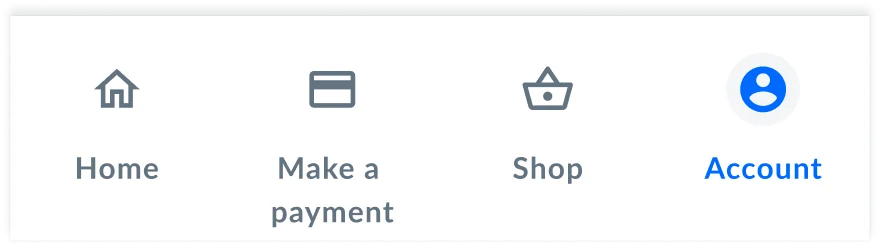
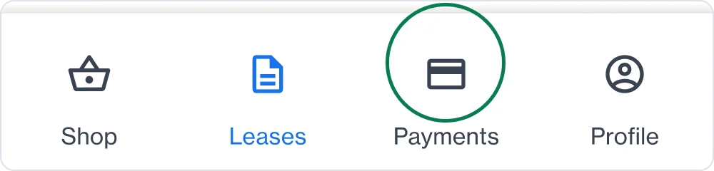
The four answers that follow live on top of this new map.
01 — THE QUESTION
Before, the dashboard showed only the next installment; the remaining total was something only the call center knew. Today, one screen answers it.
LEASING DETAILS
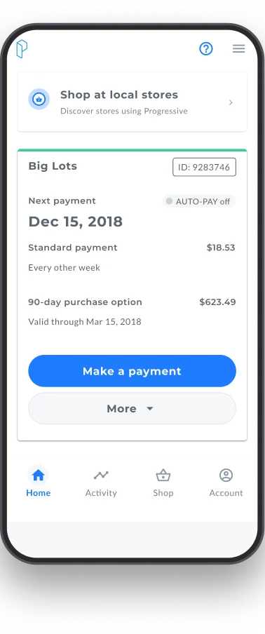
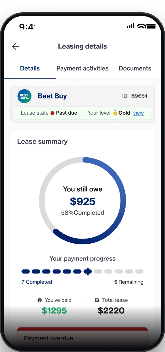
The ring answers it all at once: how much I've paid, how much I owe, and when it's due.
02 — THE QUESTION
The most expensive question of all: paying meant navigating a maze. Here it is in full — and the decision that removed it.
HOW YOU USED TO PAY — six variants of this journey
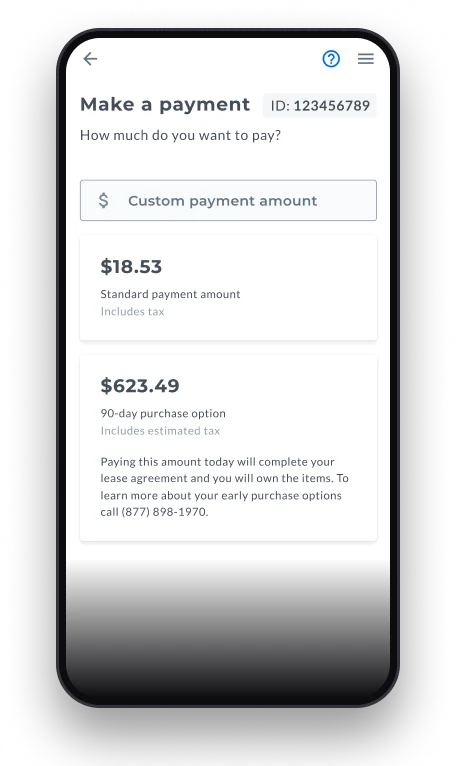
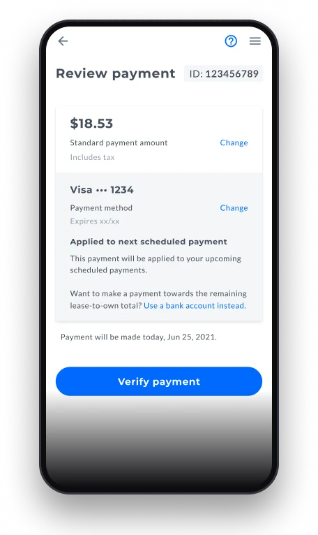
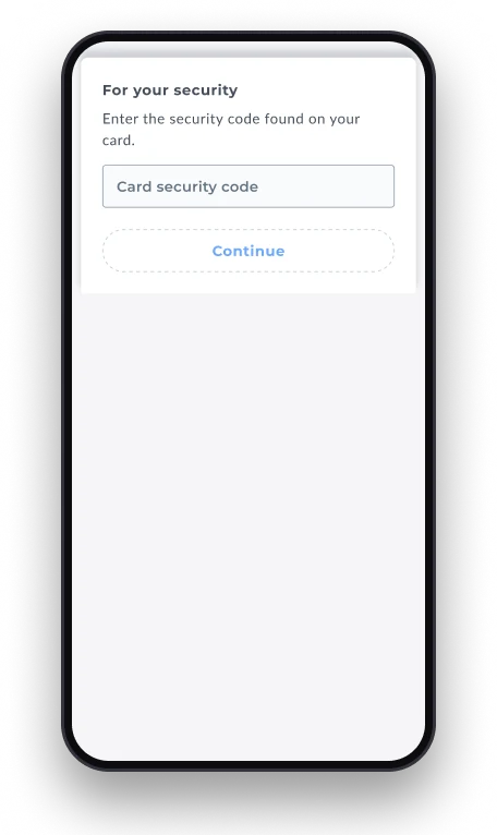
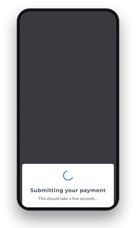
THE DECISION — Amount, saved method, and security code in a single view. One confirmation. The trade-off: higher density, resolved with hierarchy and states.
HOW YOU PAY TODAY — a single journey

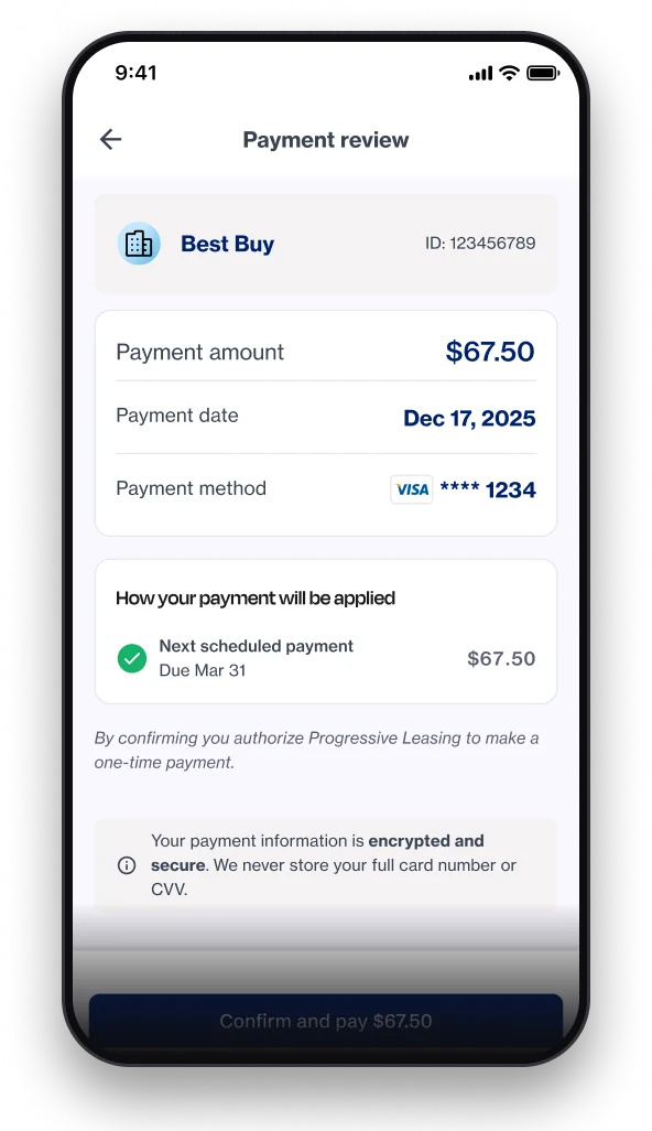
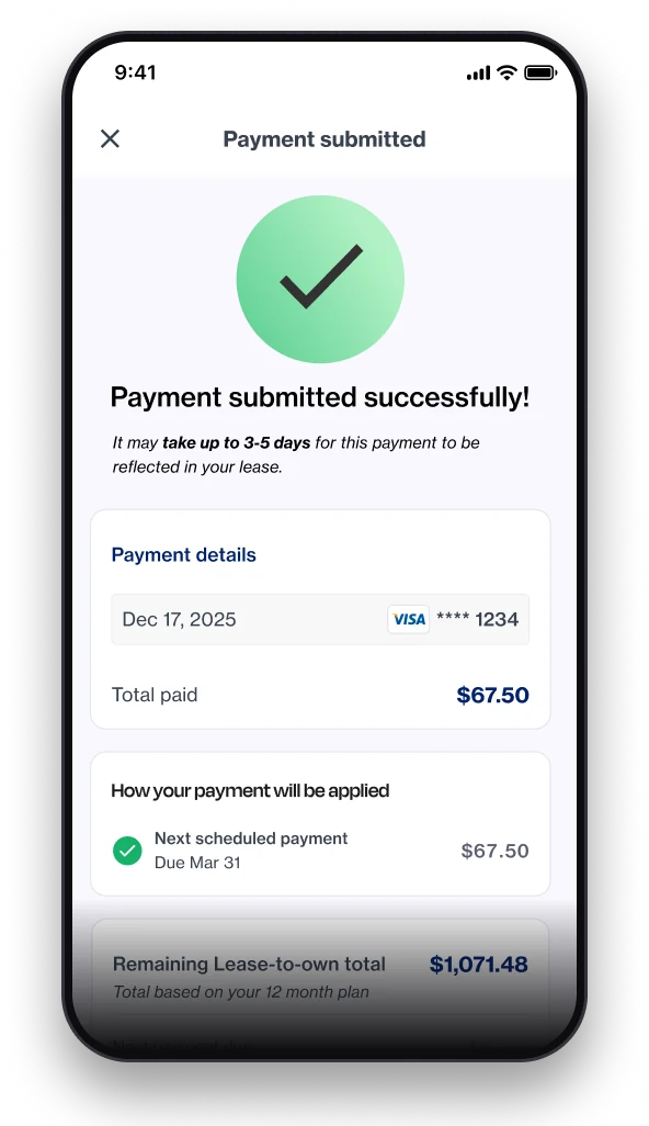
THE RESULT — measured with real traffic
Completed payments
16.6%67.4%
Payment success
69.5%97.2%
03 — THE QUESTION
The reviews shouted it: payments left “unprocessed” with no warning. Today the history answers before the doubt even shows up.
PAYMENT HISTORY

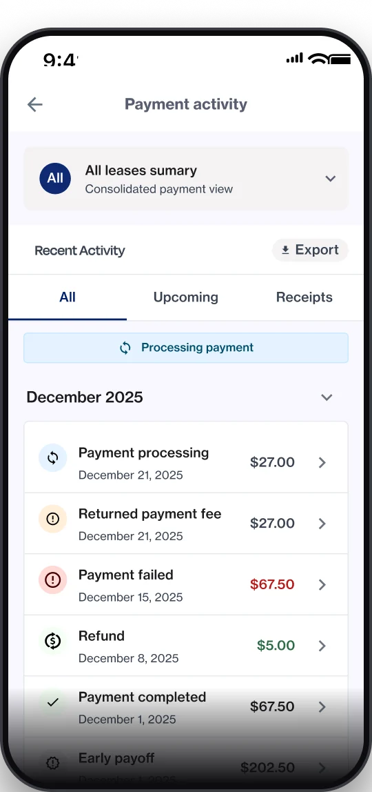
The full history, with filters and export — a view that didn't exist before.
04 — THE QUESTION
Before, “your stuff” was a menu. Today everything has its place: your leases in one territory, your payment methods in another.
LEASES
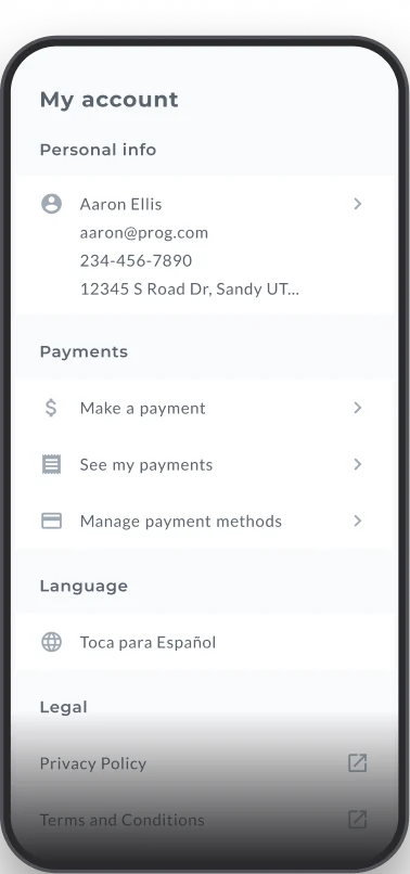
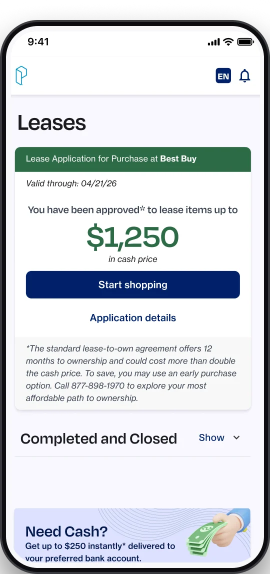
From menu rows to a territory of its own: requests, approvals, and active or closed leases.
PAYMENT METHODS
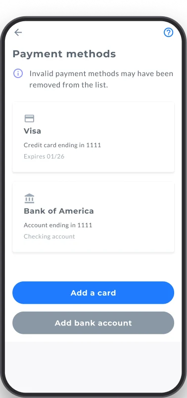
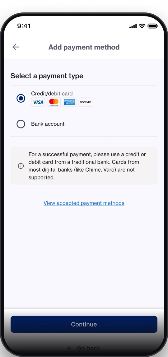
Saved methods move front and center: paying with your usual one takes a single tap, and adding a new one stopped getting in the way.
Four questions that used to be phone calls. Today they're screens.
THE PROOF AND THE CLOSE
THE METHOD — roll out gradually, measuring every step
10%
first, a small group
can people actually pay? — yes
25%
then, 1 in 4
new vs. old, live
100%
only then, everyone
the numbers gave the green light
THE VERDICT
97.2%
Payment success
before: 69.5%
67.4%
Completed payments
before: 16.6% (4× improvement)
+13
NPS
with 55% promoters
SIDE NOTE — WHAT GOT BUILT ALONG THE WAY
A bridge plugin connecting Figma to code and AI: 100+ operations — bulk edits, tokens, exports — turning hours into minutes.
That bridge built and maintains the system: tokens, variants, and states linked together, aligned with Storybook.
BridgeUX + Claude Code: design, code, and documentation in a single flow — work that used to take a team.
IN MY OWN WORDS
“This project taught me that the best redesign is invisible: people simply stop calling.”
“And that a designer who orchestrates AI agents can move an entire company.”