−36%
Detection time
Vulnerabilities found and handled a third faster.
11 days7 days
11 days7 days
year 1year 2year 3
average detection time
CASE STUDY — COALFIRE
Cybersecurity B2B · SaaS Platform · 3 years end-to-end
My role: research, UX, UI, and design QA — from the initial audit to the design system.
Coalfire, a cybersecurity leader, acquired Neuralys and brought me on to transform it into Hexeon: the platform where analysts and pentesters hunt vulnerabilities against the clock. Every minute lost deciphering the tool is a minute the vulnerability stays alive.
−36%
Detection time
Vulnerabilities found and handled a third faster.
average detection time
+25%
Adoption
The platform's key features finally got used for real.
weekly use of key features
+20
Technical satisfaction
SUS score among analysts and pentesters — the toughest audience there is.
satisfaction (SUS)

THE BRIEF AND THE DIAGNOSIS
Transform Neuralys — just acquired by Coalfire — into Hexeon: the platform where analysts and pentesters hunt vulnerabilities.
Before touching anything, I audited the entire platform: a screen-by-screen review, with a severity rating for every issue found.
Four root wounds — the cards below, which also serve as this story's table of contents.
THE DIAGNOSIS — four root wounds (and this story's table of contents)
THE ORIGIN OF THE PROJECT
Every minute lost deciphering the tool was a minute the vulnerability stayed alive.
Analysts were fighting the platform instead of fighting the vulnerabilities. That was the project's starting point.
FINDING 01
Everything revolved around the asset; the finding lived buried inside it, and the analyst had no sense of where they stood or what was urgent.
→ Answer: a new map and a dashboard
FINDING 02
The platform spoke in machine code, not in the language of the person making decisions.
→ Chapter: language
FINDING 03
Irreversible buttons with no warning: touching them was scary, and fear stalls people.
→ Chapter: trust
FINDING 04
Same data, different logic in every view; everything had to be relearned.
→ Chapter: design system
Four root wounds. Before touching them, I had to measure how much they hurt —
THE PROBLEM, IN NUMBERS
The average time to detect and handle a vulnerability was 11 days — and fewer than half of the key features were used each week.
Heuristic audit, analyst interviews, and benchmarking all pointed to the same pattern: the tool was slowing down the expert.
Every finding stuck in the platform stayed an open window for the attacker: the cost was risk, not just time.
11 days
average time to detect and handle a vulnerability
48%
of key features actually got used each week
SUS 58
analyst satisfaction: failing grade
WHAT THE RESEARCH SHOWED
Serious and critical problems in the core flows
The audit against Nielsen's 10 heuristics flagged them for immediate fixes.
Heuristic audit · Nielsen
Even the expert got lost
Interviews with analysts and technical stakeholders confirmed the day-to-day pain.
Interviews · analysts and technical team
“The competition made it simpler”
Benchmarking showed clearer flows and simpler language in other security platforms.
Benchmarking · security platforms
Summary of the project's actual research — audit, interviews, and benchmarking.
With the numbers in hand, the rebuild began —
THE REBUILD
Each of these questions used to mean lost time — with the clock running.
FIRST, THE MAP
The structural answer came first. Neuralys revolved around the asset, and the finding lived buried inside each one. But the analyst doesn't work by asset: they work by engagement, against the clock. I mapped the real flow and, on top of that evidence, built the new map: program → engagement → finding.


The answers that follow live on top of this new map — program, engagement, finding.
01 — THE QUESTION
Before, the analyst had to piece together the engagement's status by hand, screen by screen. Today the central dashboard answers it all at once: findings, progress, and what's urgent.
THE HOME SCREEN


Home answers it all at once: what happened, what changed, and what's urgent.
WHAT I RULED OUT — five paths that didn't fix it
THE DECISION — One bet: rebuild the central dashboard first, where the analyst's time was dying the fastest.
THE BET — everything on the central dashboard
THE RESULT — measured over three years
Detection time
11 days7 days
Use of key features
48%60%
The analyst now knows where they stand. But the screen still spoke a foreign language —
02 — THE QUESTION
The platform spat out acronyms, codes, and tables with no hierarchy. I translated every piece of data into the language of the person making decisions: findings with clear names, visible severity, and context to act on.
THE OVERVIEW

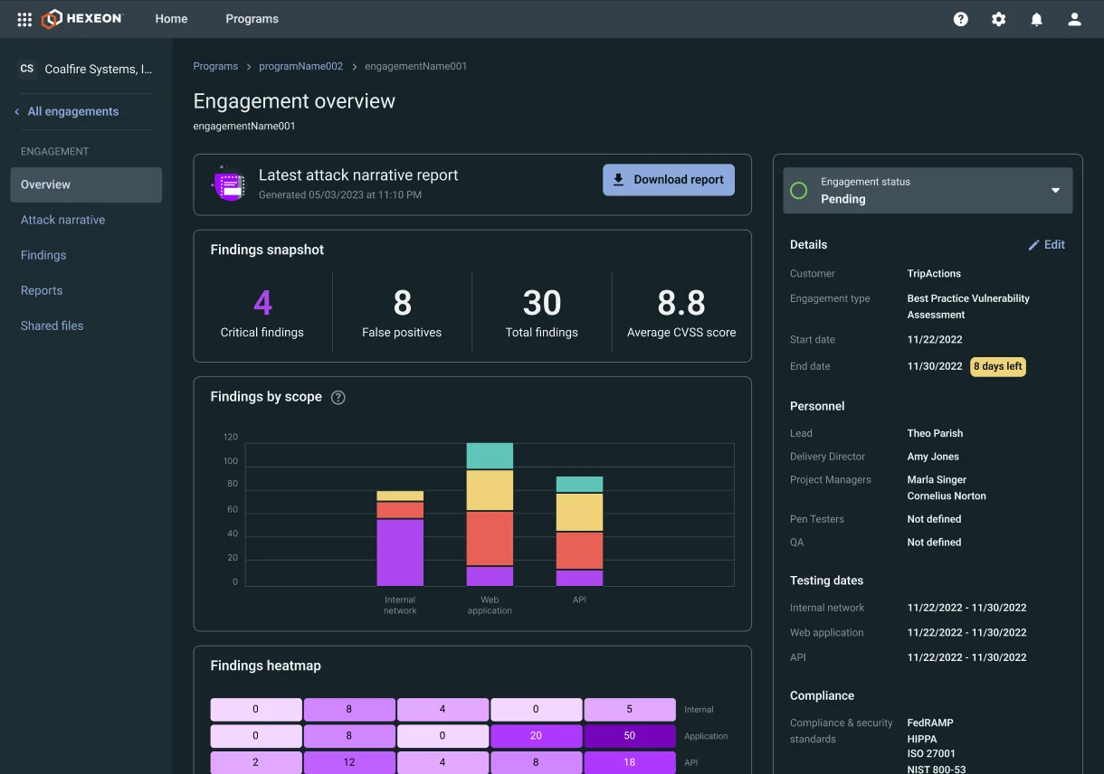
The same overview, said in human terms: findings with names, progress, and what's next.
03 — THE QUESTION
Before, creating anything meant a blind modal: instructions, raw fields, and a button that gave no feedback. Today the form guides, validates, and confirms.
CREATING, WITH A SAFETY NET


Creating a finding today: clear fields, guided severity, and an action that confirms before and after.
04 — THE QUESTION
Before, the same data followed different logic in every view: everything had to be relearned. Today a single design system — tokens, components, and documentation — governs every screen.
ONE SINGLE SYSTEM


One system: learning one screen means learning them all — and the team builds without reinventing.
Four questions that used to be lost minutes. Today the screen answers them — and the clock is back on our side.
THE PROOF AND THE CLOSE
THE METHOD — three years, the same yardstick, one step at a time
Year 1
the new map and the dashboard
does the analyst know where they stand? — yes
Year 2
the language and the actions with a safety net
the platform speaks clearly and responds
Year 3
the system, on every screen
the team builds without reinventing
THE VERDICT
7 days
Detection time
before: 11 days (−36%)
60%
Use of key features
before: 48% (+25%)
78
SUS
before: 58 — the toughest audience there is
SIDE NOTE — WHAT GOT BUILT ALONG THE WAY
Tokens, components, and living documentation — with dark mode — the shared rules for every screen in Hexeon.
Research, UX, UI, and design QA in one person: from the heuristic audit to the system, with no design team behind it.
From the Neuralys acquisition to Hexeon in production: the same hand from start to finish, measuring every year with the same yardstick.
IN MY OWN WORDS
“In security, design isn't measured in screens but in minutes: every one I give back to the analyst is one I take from the attacker.”
“And I learned that a design system isn't a luxury for big teams: it's what lets one person do the work of several.”