+18%
Benefit usage
More customers discovering and using Club Entel every month.
base+18%
base+18%
beforelaunchafter
benefit usage rate
CASE STUDY — ENTEL
Telecommunications · Mobile and web app · Research, UX and UI
My role: research, UX, UI and architecture — from in-store interviews to the final mockups.
Entel, Chile's largest mobile carrier, had a benefits club almost nobody could find inside its app. The brief: finding, redeeming and valuing benefits should take three steps, not an expedition. Every benefit a customer never sees is one more reason to leave.
+18%
Benefit usage
More customers discovering and using Club Entel every month.
benefit usage rate
−9%
Drop-off
Fewer people giving up midway through redemption.
drop-off in key flows
+23%
Weekly engagement
The Club stopped being a forgotten tab and became a habit.
weekly engagement

THE BRIEF AND THE DIAGNOSIS
Redesign Club Entel inside the app: a customer should discover relevant benefits, redeem them in three steps, and understand how much they're gaining.
Benchmarking against competitors' clubs, five guerrilla interviews at Entel stores, and an affinity map to organize what people said.
Four root wounds — the cards below, which also serve as this story's index.
THE DIAGNOSIS — four root wounds (and this story's index)
WHERE THE PROJECT STARTED
The benefits existed. The problem was they lived hidden, were poorly explained, and didn't feel personal.
Frequent customers, occasional ones, and one who never opened the Club at all: everyone described the same wall. That was the project's starting point.
FINDING 01
Nobody knew what they had or where to look for it; the section needed to be visible and surface itself.
→ Answer: a Club Home
FINDING 02
Redeeming was an unintuitive process; people wanted a direct button.
→ Chapter: redemption
FINDING 03
Many benefits felt irrelevant; people wanted recommendations based on their interests.
→ Chapter: relevance
FINDING 04
It wasn't clear how much you were saving or under what conditions; the value was invisible.
→ Chapter: transparency
Four root wounds. Before touching them, I had to measure how much they hurt —
THE PROBLEM, WITH EVIDENCE
Of five people interviewed, only two used the Club regularly and one didn't know it existed — inside the very app they opened every week to pay their bill.
Benchmarking showed competitors already surfaced, filtered and explained their benefits; the interviews confirmed people wanted exactly that.
A benefit that goes undiscovered doesn't build loyalty: every customer who doesn't see the Club's value is one more customer easily won by the next offer.
2 of 5
used the Club regularly; the rest, rarely or never
4
pain categories emerged from the affinity map
3 taps
was the access promise — one nobody actually met
WHAT THE RESEARCH SHOWED
“I'd rather be notified about benefits than have to search for them”
Discovery was the first wall: the section existed, but nobody found it without help.
Interviews · frequent and occasional users
“I wish there were a direct button to redeem”
The redemption process was confusing and long; people abandoned it halfway through.
Interviews · Entel stores
“I don't really understand how much I'm saving”
Without visibility into savings or conditions, the benefit didn't seem worth the effort.
Affinity map · trust and transparency
Synthesis of the project's actual research — benchmarking, interviews and affinity mapping.
With the evidence in hand, the rebuild began —
THE REBUILD
Each of these questions used to end in a benefit left unused.
FIRST, THE MAP
The structural answer came before everything else. The Club lived buried under the account menu, and every task crossed screens that had nothing to do with benefits. I crossed business goals with user goals, prioritized with MoSCoW, and drew the new architecture: the Club as its own territory, with coupons, partnerships, events and points one tap away.
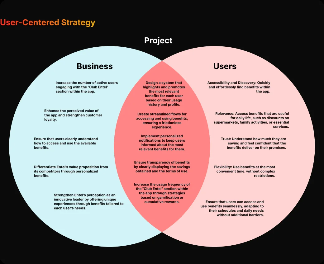
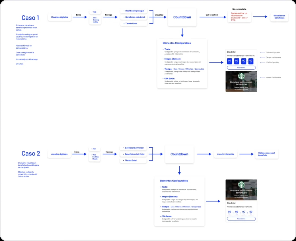
On top of this new map — coupons, partnerships, events and points — live the answers that follow.
01 — THE QUESTION
Before, benefits were scattered and hidden; finding them was an expedition. Today the Club Home shows them all at once: coupons, partnerships, events and points, with what's new listed first.
THE CLUB HOME
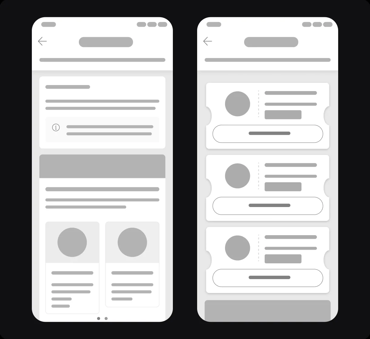
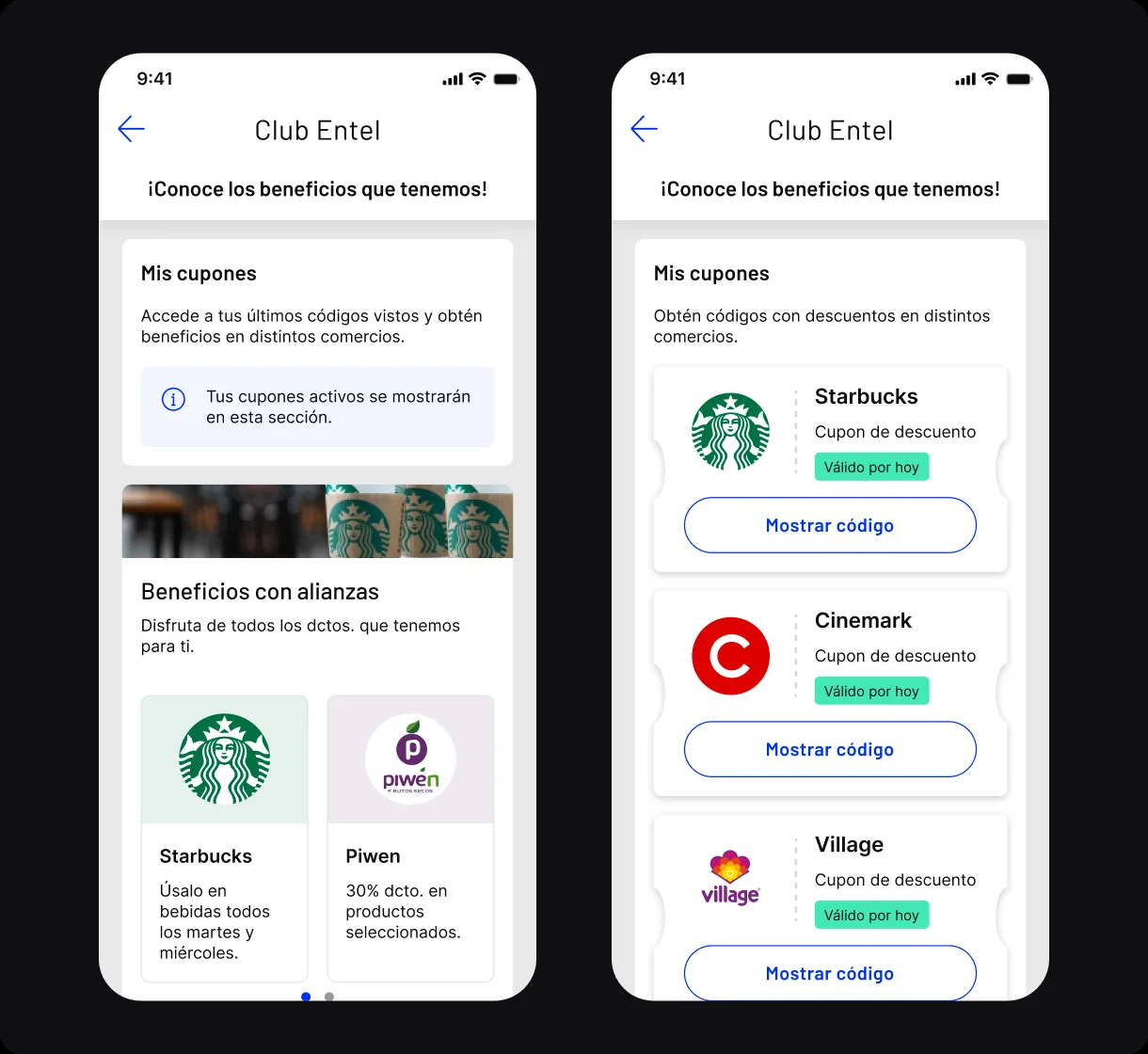
Everything the customer has, on one screen and in order: what's new, what's active, and what's expiring.
WHAT I RULED OUT — five paths that didn't cure it
THE DECISION — One bet only: give the Club its own territory in the app, with everything the customer has in plain sight.
THE BET — everything on the Club Home
THE RESULT — measured after launch
Benefit usage
base+18%
Weekly engagement
base+23%
The customer now knows what they have. But redeeming it was still a maze —
02 — THE QUESTION
Before, redeeming was a confusing process people abandoned halfway. Today it's one button: “Show code,” the coupon on screen, the QR ready for checkout.
REDEMPTION
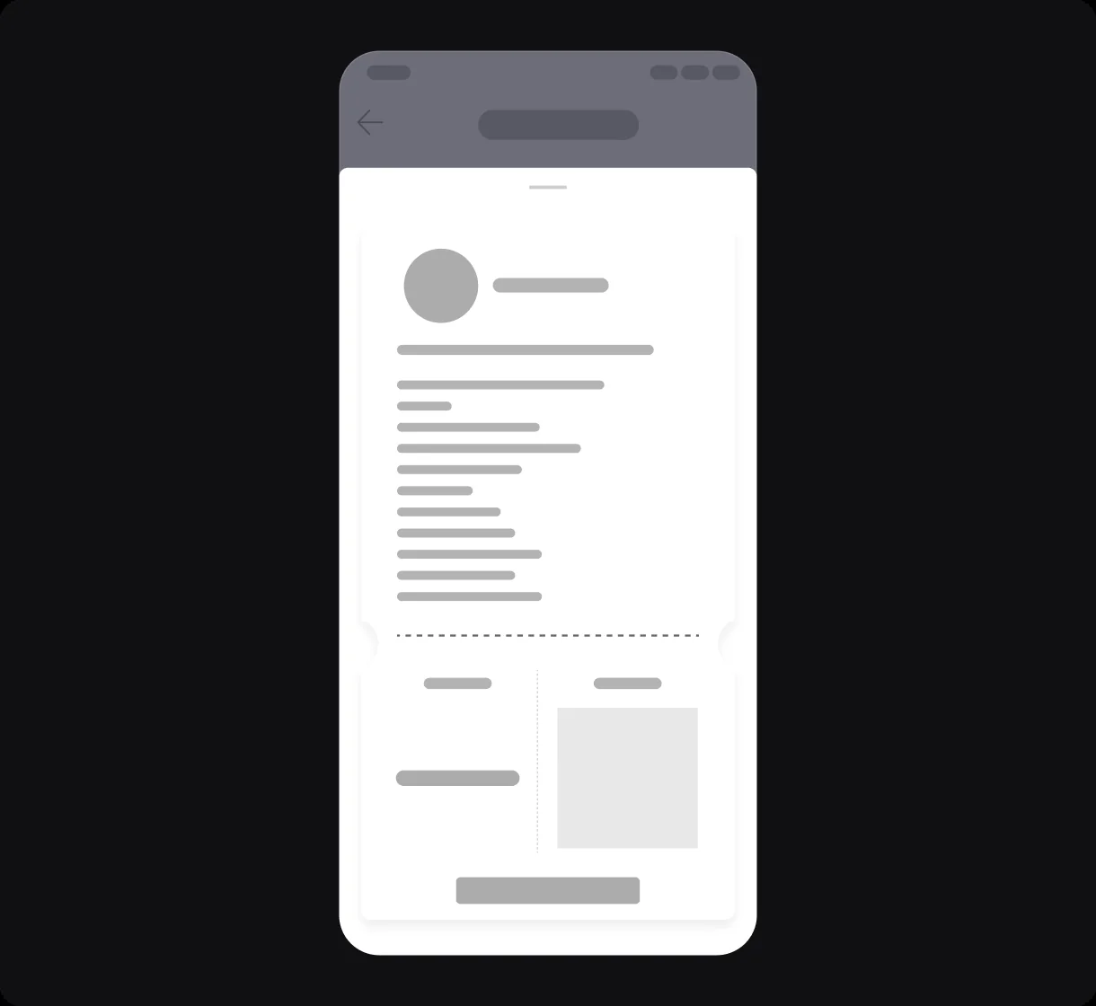
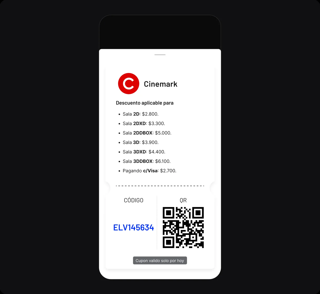
Redemption in one tap: code, QR and how long it lasts, without leaving the screen.
03 — THE QUESTION
Before, benefits felt built for someone else. Today they're organized by category and moment — coffee, movies, events, reforestation — and the Club remembers what the customer has already seen.
RELEVANCE

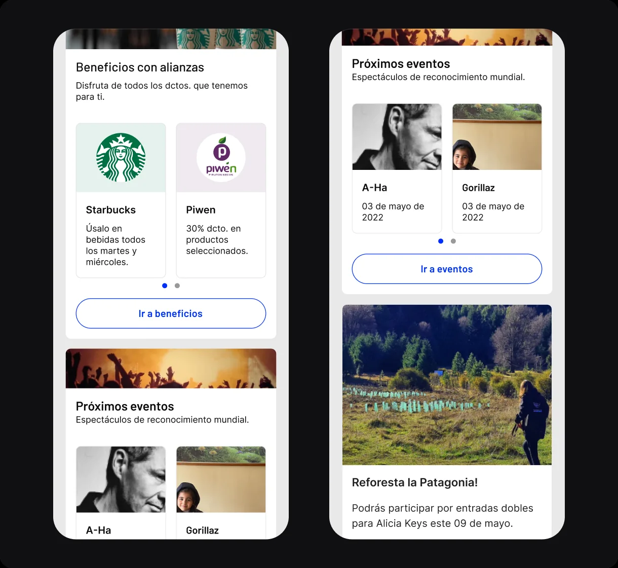
Benefits with a name and context: when to use them, where, and what I gain from each.
04 — THE QUESTION
Before, nobody knew how much they were saving or under what conditions. Today accumulated points, validity and rules are all in plain view — in the app and on the web.
TRANSPARENCY
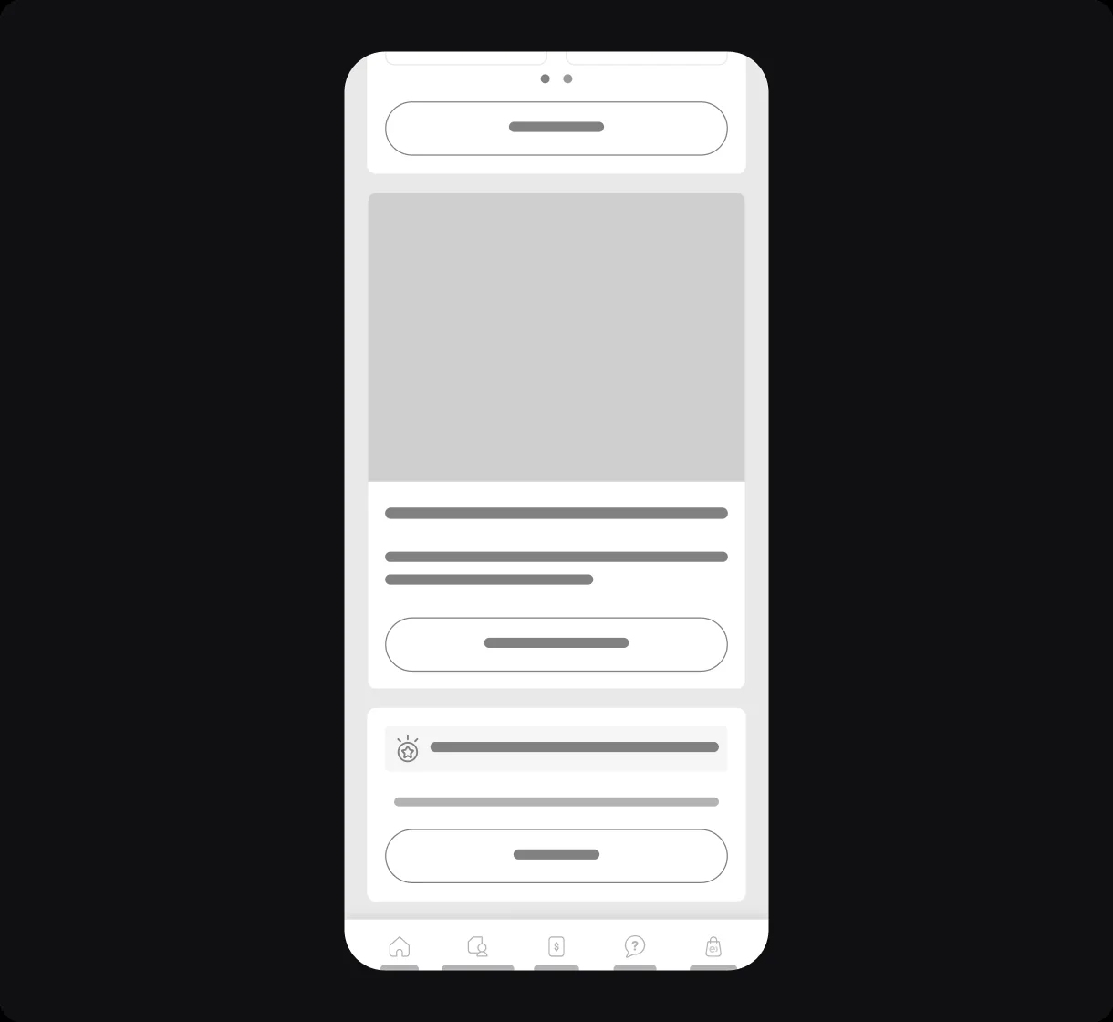
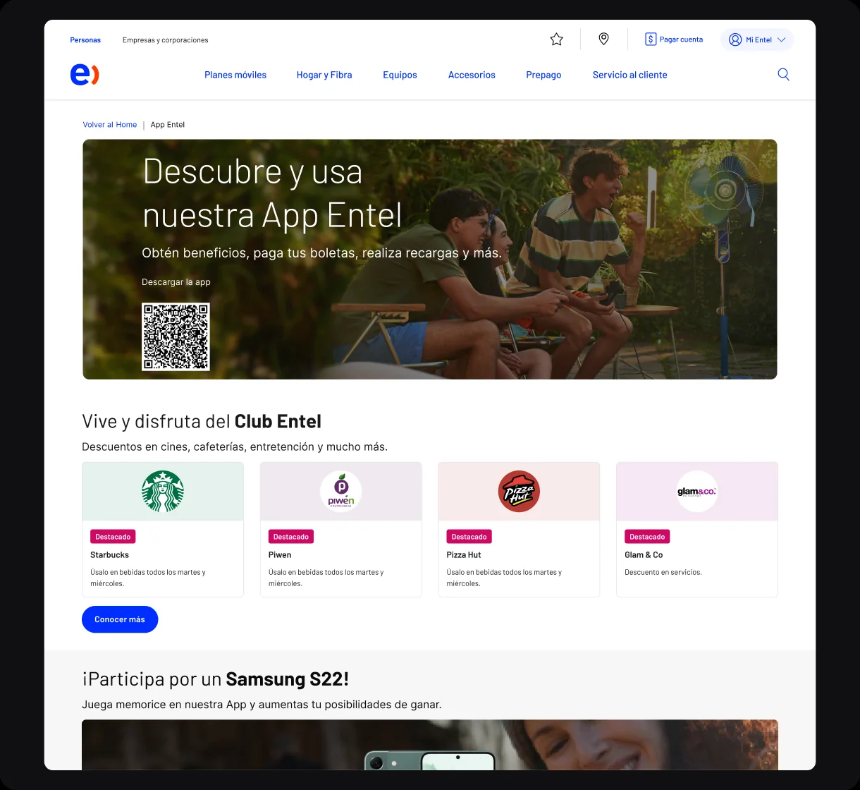
Value in plain sight: points, validity and conditions spelled out in human terms, in the app and on the web.
Four questions that used to end in unused benefits. Today the screen answers them.
THE PROOF AND THE CLOSE
THE METHOD — from the store to launch, one step at a time
Step 1
benchmarking, interviews and affinity mapping
why is nobody reaching the Club? — four wounds
Step 2
strategy, MoSCoW and architecture
what gets built first and what doesn't get built
Step 3
sketches, wireframes and mockups
from freehand drawing to the app and the web
THE VERDICT
+18%
Benefit usage
more customers using the Club every month
−9%
Drop-off
fewer people giving up during redemption
+23%
Weekly engagement
the Club, turned into a habit
ON THE SIDE — WHAT GOT BUILT ALONG THE WAY
MoSCoW with the must-haves, the nice-to-haves and what wouldn't be built: favorites, filters, recommendations and points, each backed by evidence.
The Club as its own territory inside the app, with its flows mapped end to end before the first screen was drawn.
The Club mockups in the app and the Club page on entel.cl, sharing the same visual language and the same rules.
IN MY OWN WORDS
“A benefit nobody finds isn't a benefit: it's a cost. Designing the Club was, above all, designing where it lives.”
“And I learned that five conversations at a store are worth more than a hundred assumptions in a meeting room.”